How to add smart components for Next.js
Content Publisher supports existing components in your React Next.js application. Use this guide to walk you through the process to add these components to your site.
Custom components from your website can be integrated into Google Docs as "Smart Components" using the Content Publisher add-on.
This document outlines the steps to make a component you use on your site available in the Content Publisher add-on to be added to a document and published to your site.
- A custom component: Content Publisher currently supports React components.
- A hosted Pantheon Content Publisher Site: Components will be sourced from the hosted site (sharing components from other sites isn’t supported).
Start by creating the component if you have not already.
For this guide, we will create a component for our movie review site that displays listing information about a movie, specifically title and description.
React:
function MovieCard({ title, desc }) {
return (
<div>
<h1>{title ?? "Title"}</h1>
<p>{desc ?? "Description"}</p>
</div>
);
}
Now that you have your components, we need to tell Content Publisher about the components. This makes them available for use in the “Insert Component” section of the add-on. We do this using the PCC SDK.
Configure the SDK following the instructions below to make your components available for use.
Create a Smart Component Map, which serves as a catalog detailing each component and its required inputs.
The following properties are required for each component in the map:
- title: The name as it will appear in the Content Publisher add-on.
- fields: Specifications of each property your component requires, including whether it's mandatory (true or false) and its data type (number, boolean, date, or string).
Locate the PantheonAPI handler’s configuration file.
The PantheonAPI handler’s configuration can be found in the /pages/api/pantheoncloud/[...command] file if you use our Next.js pages example starter. (it may end in either .js or .ts depending on whether you are using typescript.)
Configure the smartComponentMap option. For instance, for our "Movie Info Card" component, specify its attributes as shown below:
export default PantheonAPI({
smartComponentMap: {
MOVIE_CARD: {
title: "Movie Info Card",
fields: {
title: {
displayName: "Title",
required: true,
type: "string",
},
body: {
displayName: "Body",
required: false,
type: "string",
},
},
},
},
});
Add this property to the pantheonAPIOptions object.
componentPreviewPath: (componentName: string) =>
`/component-preview/${componentName}`,
If you are using nextjs pages router, then create a folder located in /pages called component-preview and a file within that called [id].tsx (or [id.jsx] if you aren’t using typescript). It should have these contents:
import { useRouter } from "next/router";
import { clientSmartComponentMap } from "../../components/smart-components";
export default function SmartComponentPreview() {
const router = useRouter();
const { id, attrs } = router.query;
const decodedAttrs =
attrs && typeof attrs === "string"
? JSON.parse(Buffer.from(attrs, "base64").toString())
: {};
const SmartComponent =
clientSmartComponentMap[id?.toString()]?.reactComponent;
return (
<div className="flex w-[100vw] h-[100vh] items-center justify-center">
{SmartComponent ? (
<SmartComponent {...decodedAttrs} />
) : (
<div>Component not found</div>
)}
</div>
);
}
Deploy your changes.
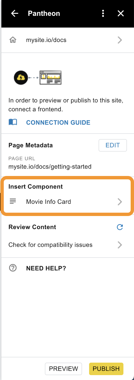
At this point, your component should show up in the “Insert Component” section of the add-on.
Content Publisher users can select the component and add it to a document.
Components are site-specific, so If you do not see the components in the add-on, you’ll want to double-check that the document is publishing to the desired site.
Finally, we need to configure our PCC ArticleRenderer to use the components we created earlier when rendering an article received from PCC.
This involves providing the previously defined smart component map to the ArticleRenderer. The key addition here is specifying the actual component to be used in rendering.
React:
Provide the smartComponentMap as a prop to the ArticleRenderer.
This smartComponentMap is the same as the smart component map we defined earlier but importantly, with a new reactComponent property.
This reactComponent should be a React component that corresponds to the fields defined in the smartComponentMap. It will receive values for the fields we define in the smartComponentMap as props.
import { ArticleRenderer } from "@pantheon-systems/pcc-react-sdk/components";
import MovieCard from "./MovieCard" // The smart component we created
// Rest of your component code
<ArticleRenderer
article={article}
smartComponentMap={{
MOVIE_CARD: {
reactComponent: MovieCard,
},
}}
/>
That’s it! Our site is configured to use PCC Smart Components 🎉
How is the schema used?
Schema is retrieved from the addon and component editor to show a component preview and create/update form.
It’s retrieved by a GET request to an endpoint “/pathToEndpoint” that the Pantheon SDK exposes in your app.
Where does the data from a component go?
Data is stored in our Firestore database. When a document is published, we retrieve the latest version of data from each component on the page. The hydrated document is stored in Firestore, which is returned when a user loads a document on a site (it doesn't get the latest component properties on every page load.)